
A full-featured real estate platform redesign with modern visual hierarchy, intuitive property browsing, and a seamless experience across desktop and mobile.
Most real estate sites bury the listings that matter under cluttered filters, slow image loading, and inconsistent card layouts. This project rebuilt the experience from the ground up — a property platform where browsing, filtering, and comparing homes feels effortless on any screen size.
The goal was a visual system flexible enough to handle dense data (price, location, amenities, agent info) without ever feeling crowded, paired with imagery-first listing cards that let the properties themselves do the selling.
Buyers abandon listings pages when they can't quickly compare options. Dense filters, inconsistent card sizing, and slow-loading property photos all add friction to a decision that's already emotionally loaded and high-stakes.
Design a browsing experience built around visual scanning — large, consistent imagery, clear price and location hierarchy, and filters that narrow results without ever hiding the listings grid itself.
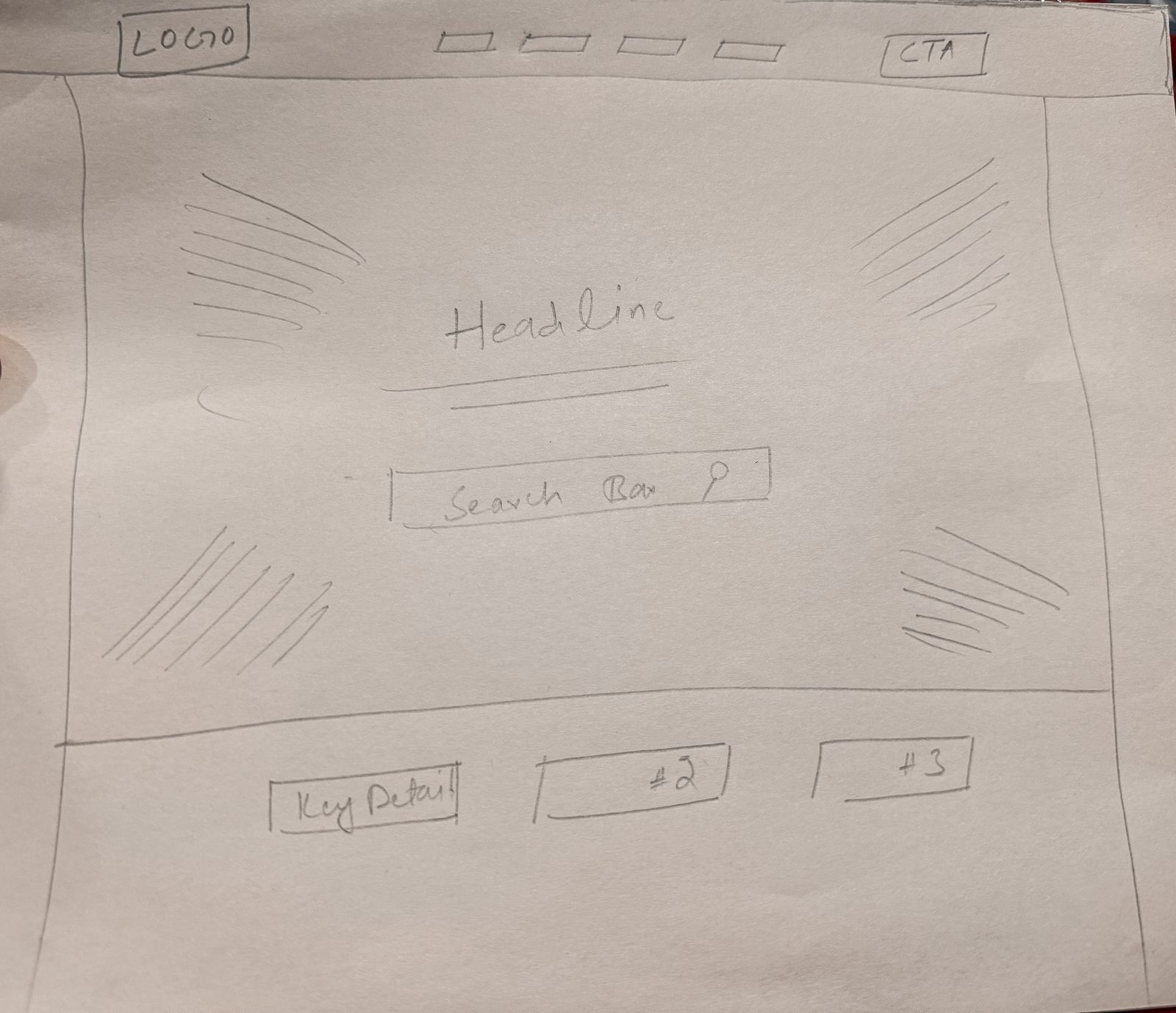
The redesigned interface organizes listings around what buyers actually decide on first — giving the platform a calmer, more confident visual identity than typical real estate UI.
This case study covers the highlights — the full gallery on Behance includes the complete screen set and detail breakdowns.