
A clean, conversion-focused landing page for a recruitment platform — built to turn curious visitors into qualified applicants without slowing them down.
Recruitment landing pages have one job: convince the right candidate to take the next step within seconds of arriving. Too much copy, vague value propositions, or a buried call-to-action and the visitor bounces before the application form ever loads.
This page was designed around a single, confident message — who the platform is for and what it offers — backed by a layout that keeps the apply action visible without ever feeling pushy.
Recruitment platforms often compete on the same generic promises. Without a sharp visual hook and a clear, immediate call-to-action, qualified candidates lose interest before scrolling past the fold.
Build a landing page with a confident headline, a clear value proposition, and a single guided path toward applying — using layout and contrast to do the persuading, not extra copy.
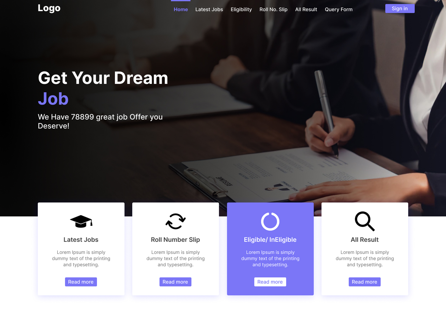
By stripping the page down to a single message and a single action, the design gives the recruitment platform a landing page that feels fast, confident, and easy to act on.
This case study covers the highlights — the full gallery on Behance includes the complete screen set and detail breakdowns.